
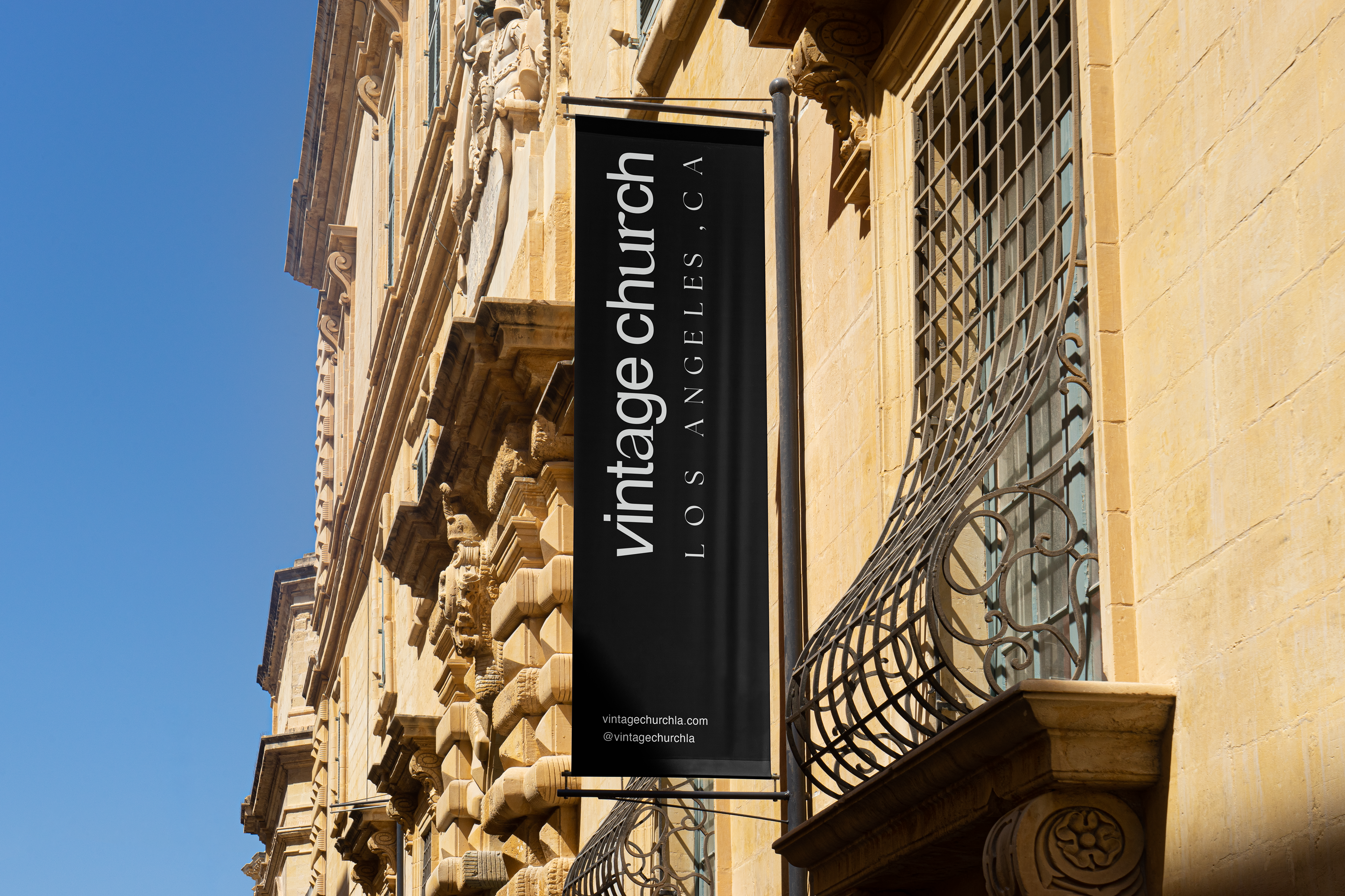
VISUAL IDENTITY PROJECT
THE CHALLENGE
Vintage Church LA's physical location poses a unique demand on its mission. The general assumption of its target audience is that the Christian faith is archaic, old and no longer relevant.
The purpose of this rebrand is two-fold:
1) to communicate the beauty of a timeless gospel in a way that is refreshing and classy
1) to communicate the beauty of a timeless gospel in a way that is refreshing and classy
2) to reflect the values of the church: word, spirit, family, mission.
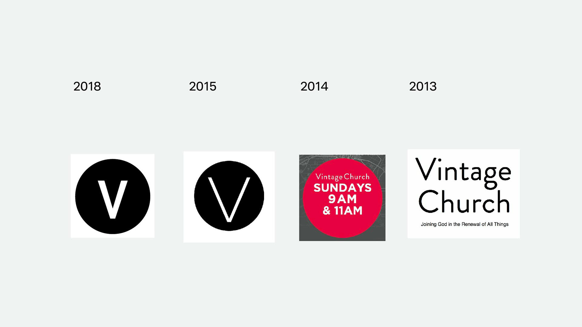
SOLUTION
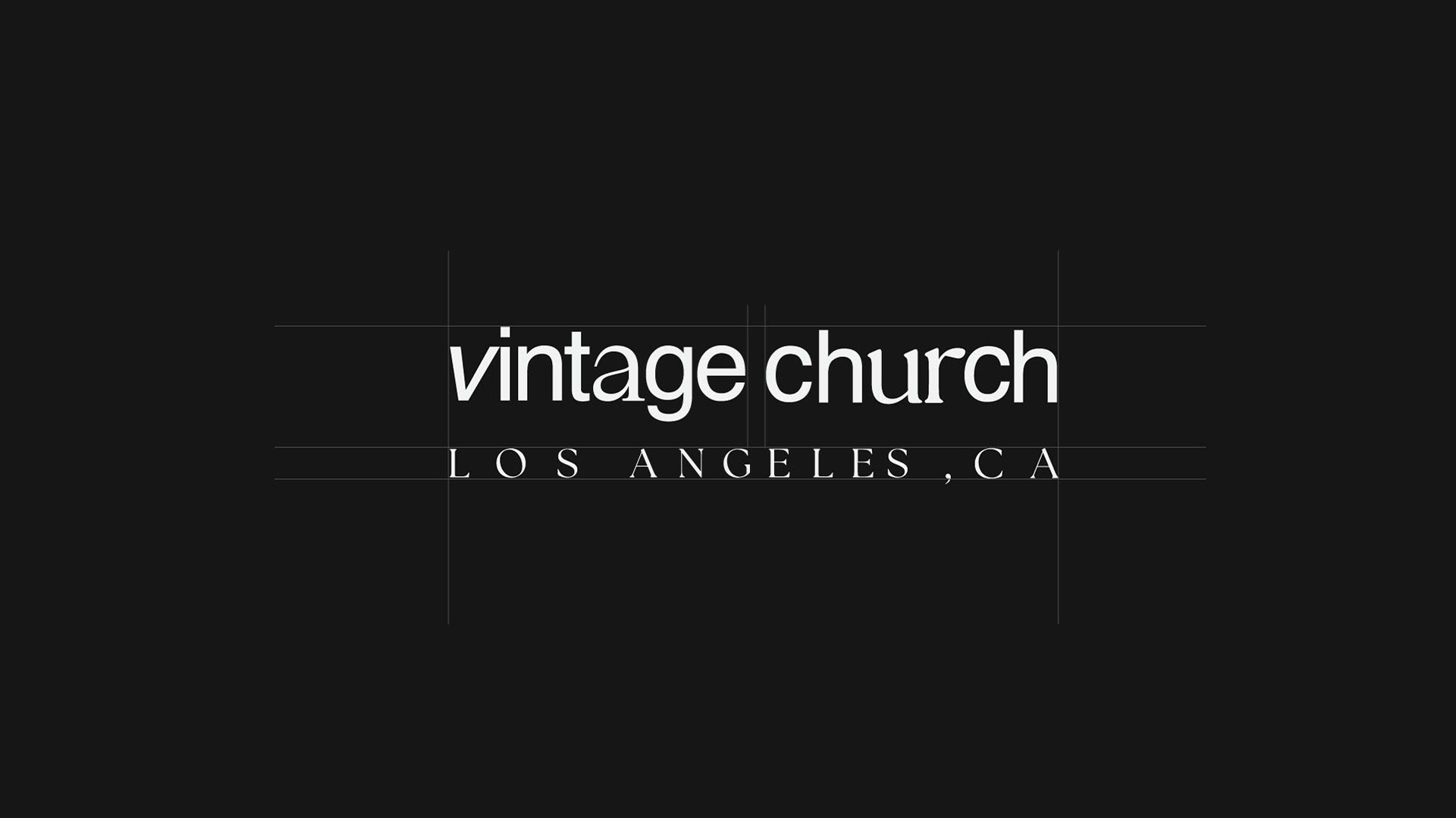
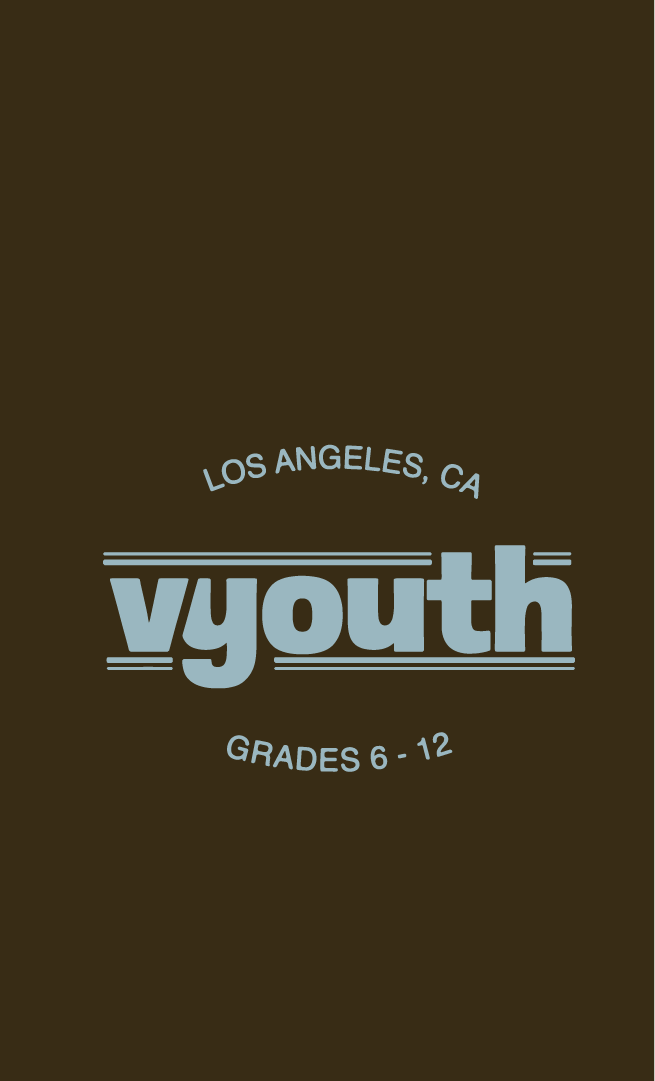
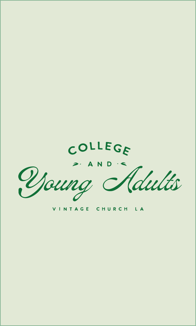
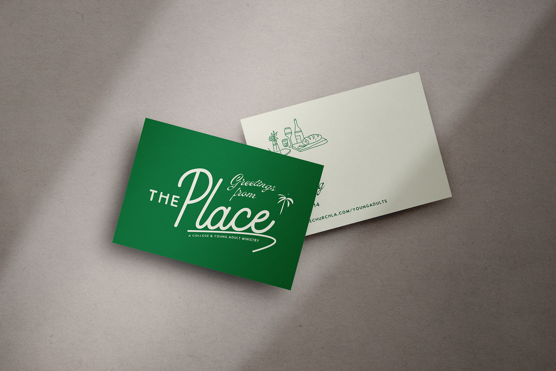
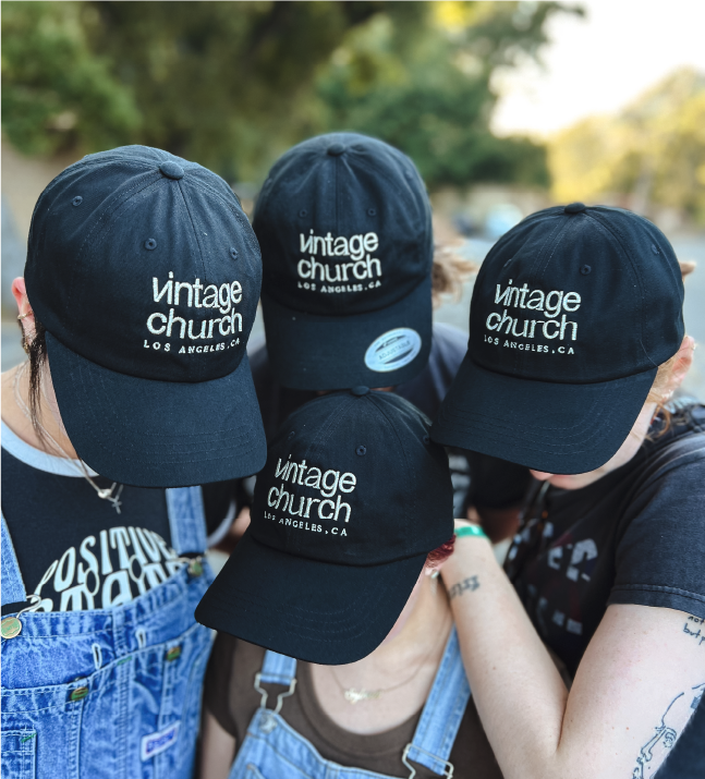
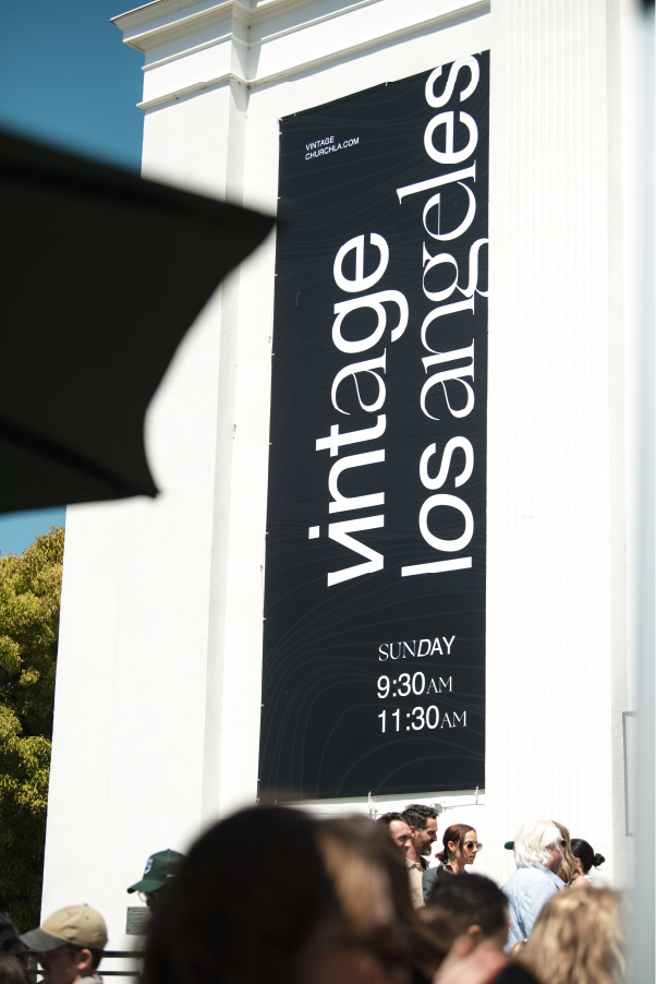
A flexible and recognizable brand system that allows its various ministries to have separate identities that mature into the parent brand. These identities include the kids, youth, college and young adult ministries, parents and general adults.
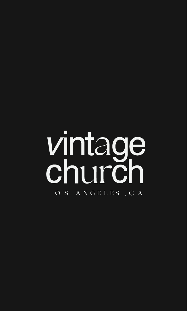
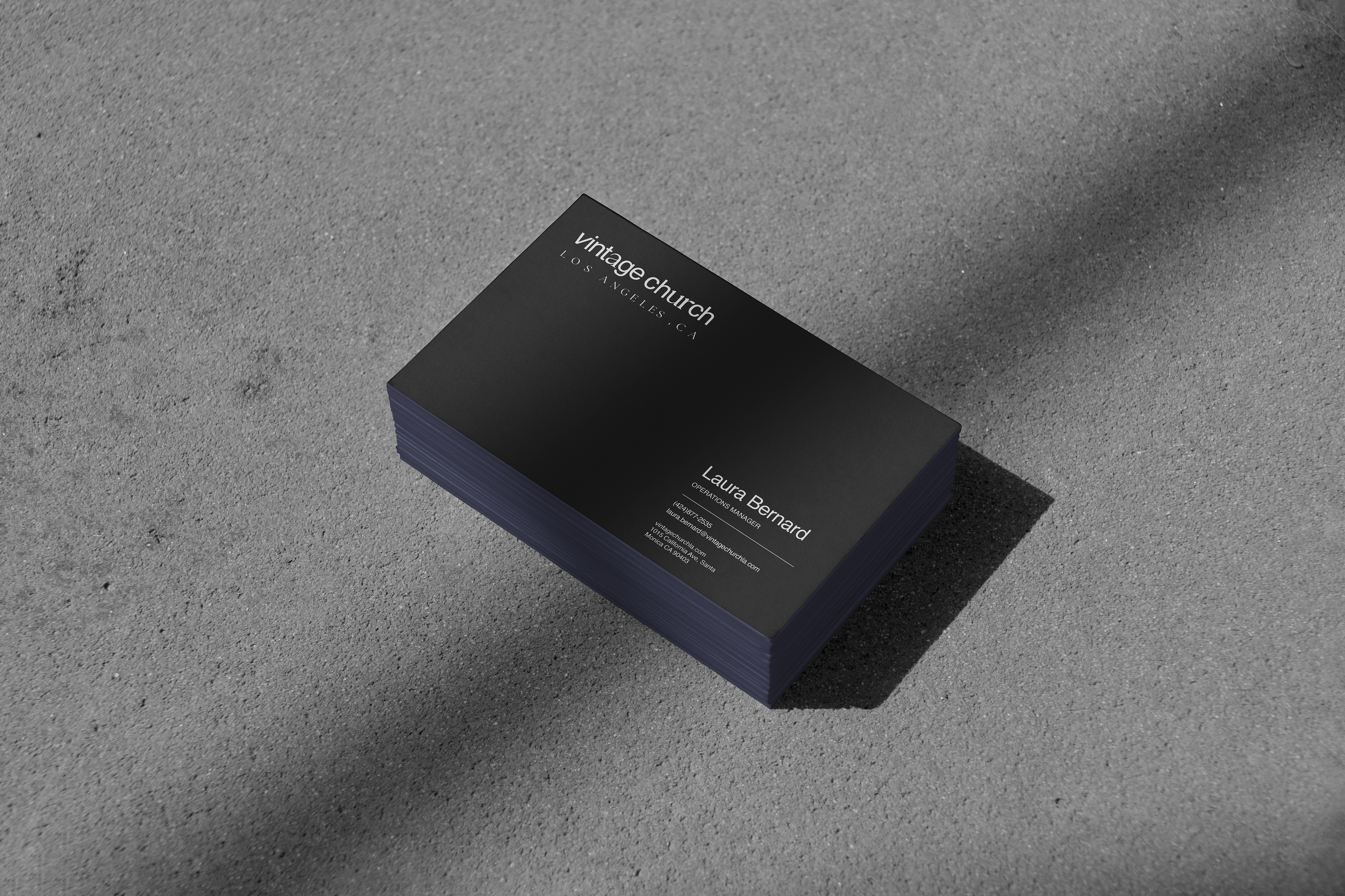
The selection of a serif & a sans serif font pairing modernizes the approach without losing the timeless nature of the gospel message. It mirrors the church's values of being both Word-informed and Spirit-driven.


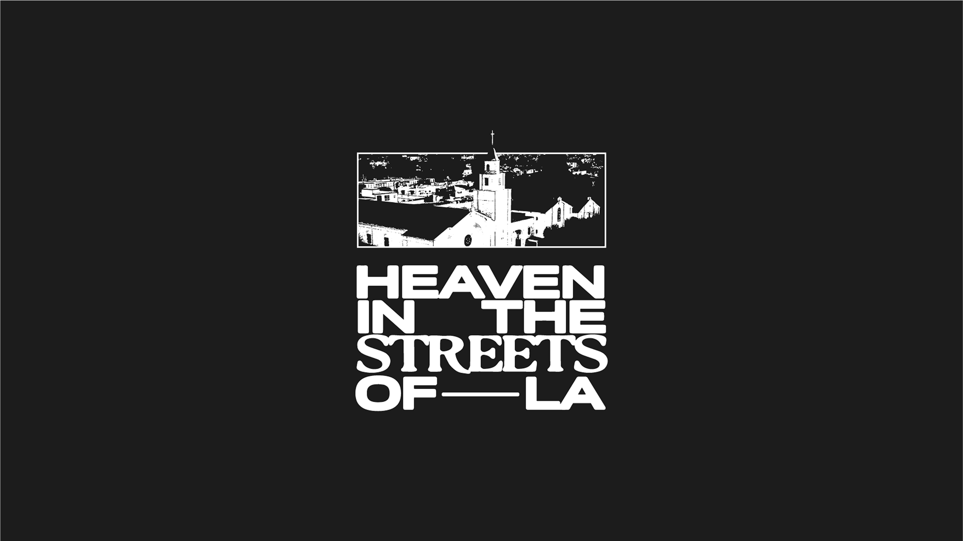
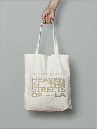
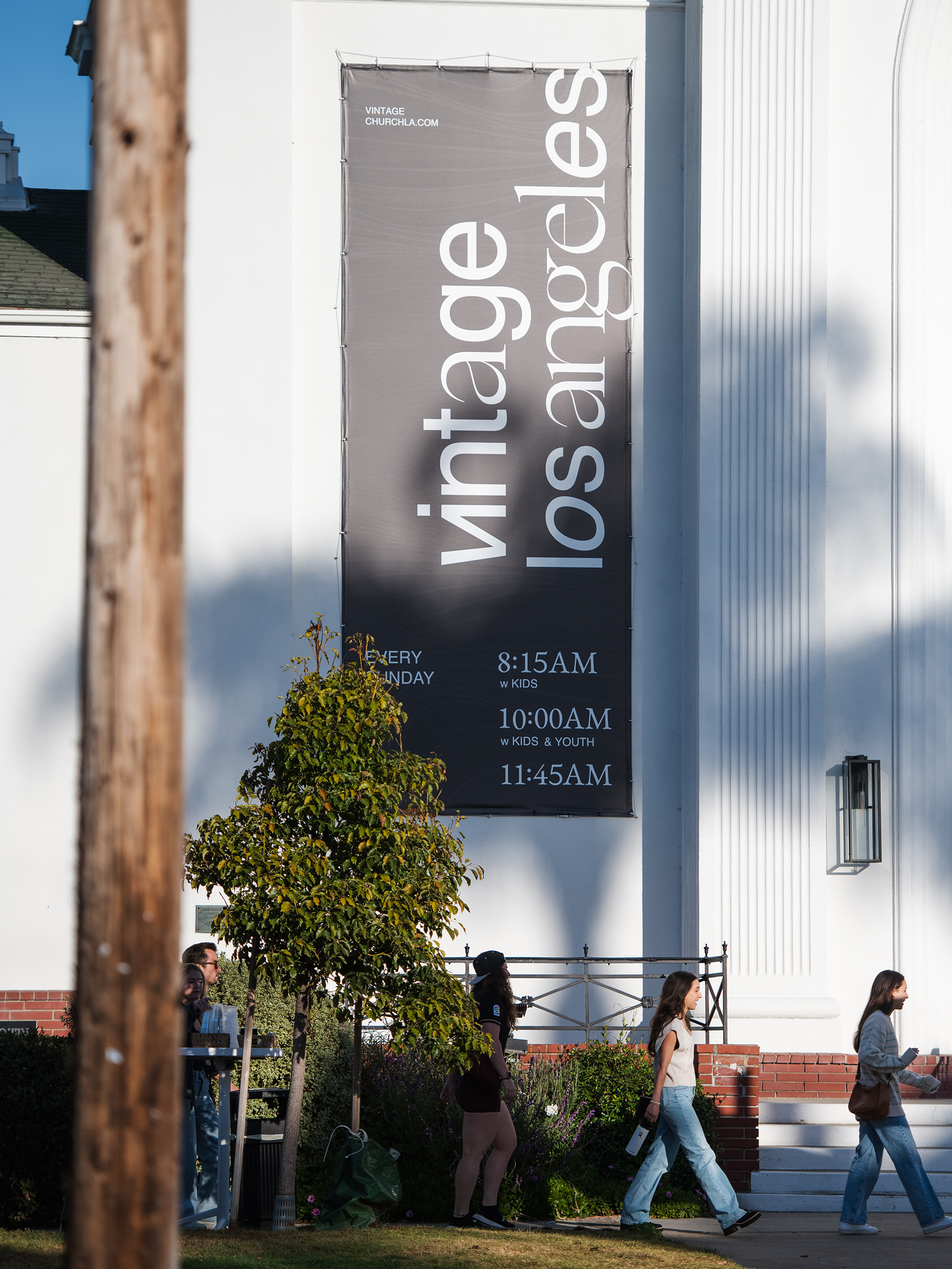
EXPLORATIONS


ADDITIONAL
Given the seasonal nature of a church following the liturgical calendar, a static branding pack proved to be insufficient for creating excitement around major holiday events such as Christmas, Easter and other church-wide campaigns.
To tackle this, we decided to create a separate category called "seasonal expressions" that allows unique logotypes to interplay with the classic logo without losing familiarity. These seasonal expressions can be switched out throughout the year to mirror the focal message of the church.